
In an uncertain yield environment, it can be difficult to estimate whether a bond vs bond fund will have a higher total return. I made a spreadsheet to help clear up some confusion regarding when (and why) Treasury bond returns could differ from Treasury bond fund returns:
Under various customizable yield curve scenarios, this spreadsheet allows you to illustrate how the returns compare between holding a new 10-year Treasury to maturity vs a hypothetical1 10-year Treasury fund.
Using the Spreadsheet: Overview
The default yield curve for this scenario initially matches the actual Treasury yield curve as of 12/1/16.2 This scenario then simulates, two years from today, a jump in the 10yr yield to 7% while the slope stays the same. After that, the yield curve is unchanged for the next 8 years, when the single 10-year Treasury reaches maturity.
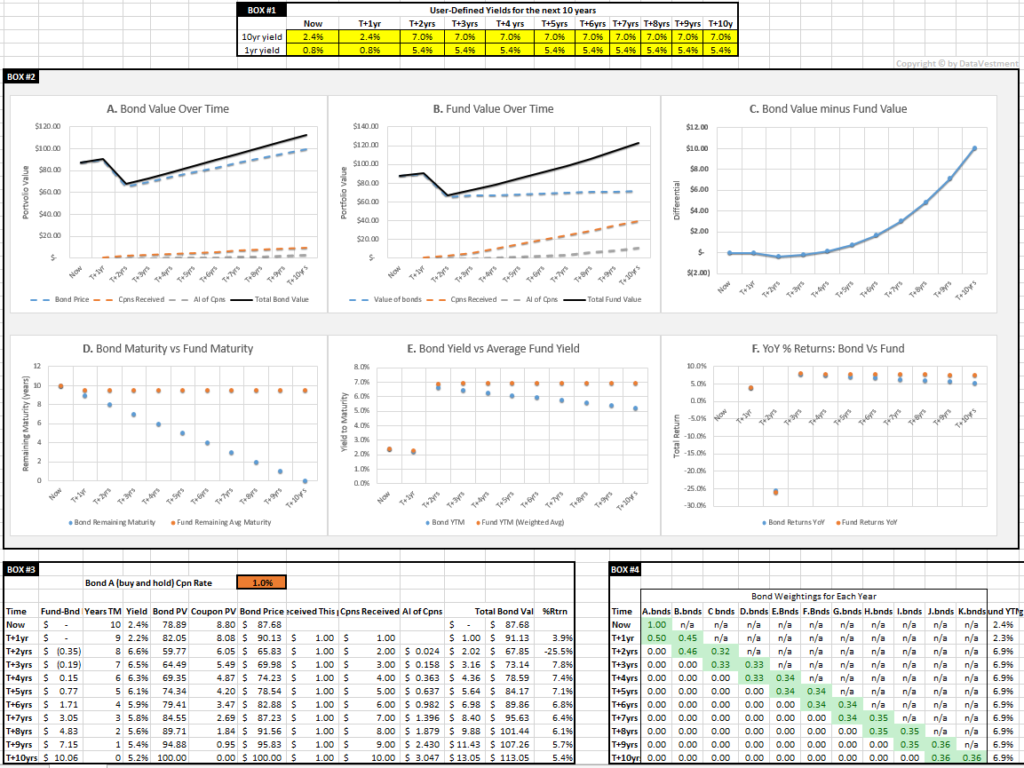
To simulate different yield curve scenarios3 over the next 10 years, you can plug in different values into the yellow cells within Box #1.
Within Box #2, Graphs A and B show the value of investing $100 into a 10yr Treasury vs Treasury fund, respectively.4 Graph C shows the fund returns minus the single bond returns.


Interpreting the Spreadsheet
The default scenario shows that, even when yields rise by over 5%, the fund will outperform the bond. In other words, if you were to buy a single 10yr Treasury and hold it until maturity (10 years from now), you’d get an 8% higher total return by instead buying our hypothetical Treasury fund and holding it over the same time period.
There are two central factors coming into play here: (Factor #1) differing sensitivity to yield changes and (Factor #2) differing returns due to the shape of the yield curve.
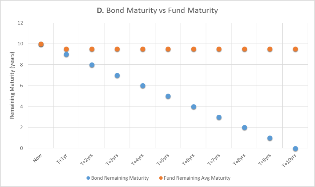
As shown in Graph D, over time the remaining maturity of the bond moves toward 0–standard for holding a bond. However, the fund is trying to maintain a constant maturity of around 9 years.10 Starting at around T+2yrs, the average remaining maturity for the bond begins to significantly differ from the remaining maturity of the fund.
Factor #1: Differing Sensitivity to Yield Changes
So why does the fund have increased sensitivity to yield changes? Without using the word ‘duration,’ here is one (hopefully intuitive) explanation:11 Let’s assume you have two Treasuries, Y and Z, which both initially have yields and coupons that all equal 1% (so the yield curve is flat). The difference is Bond Y matures in 5 years while Bond Z matures in 10 years.
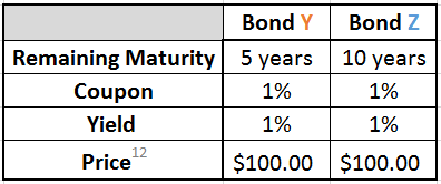
Next let’s say that, for both bonds, yields jump from 1% to 3% – and remain that way for the next 5 years. Now here is what we have:
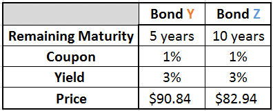
Bond Z just dropped $7.90 more in price. Why is that? Some considerations:
- We know that Bond Y will be priced at $100 in 5 years – since it’s a Treasury, it’s considered risk-free and will return the par value of $100 at maturity.
- Both Bond Y and Bond Z will13 now offer an annual yield-to-maturity of 3%.
- Both coupons are fixed at 1%.
- So we need an extra 2% (roughly)14 of total annual return to make up for the yield minus coupon shortfall.
- That 2% can’t come from the coupon, so it has to come from price appreciation of the bond.
How much do the bond prices need to appreciate? If these bonds had only one year to maturity, we can estimate that the bonds would drop to somewhere around $9815 because $2 price appreciation + $1 coupon would roughly get us to the market-mandated 3% yield.
So what changes as we examine remaining maturities that are greater than one year? We can again estimate for two years remaining maturity that the price is going to fall to somewhere in the ballpark of $96 (two years of $2 price appreciation + $1 coupons). The further the price falls, the more room there is for price appreciation.
Expanding this estimation logic to 5 or 10 years of remaining maturity, for a given yield increase, we can see that the price is going to have to fall further as the remaining maturity increases. The yield minus coupon shortfall has to be remedied for each year of remaining maturity, and in this case it has to be made up for through price appreciation. The more years that need to be made up for (as is especially the case for Bond Z vs Bond Y), the more the price needs to fall immediately.
Formalizing this logic leads us to the present value formulas (as used in the spreadsheet)–for a more in-depth discussion of these, please see here or here.
Factor #2: Differing Yields and YoY Returns
As mentioned above, in addition to having a higher sensitivity to yield changes, the Treasury fund will also have a higher yield than the single Treasury as time progresses. As shown in Graph E, starting at T+2yrs, the fund yield starts to exceed that of the single Treasury.
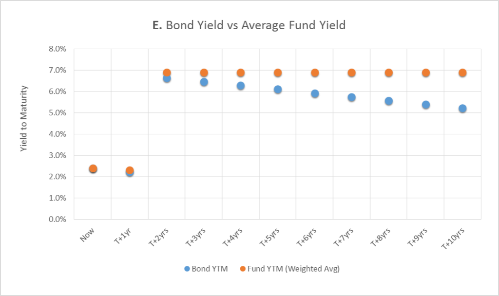
The shape of the yield curve is the cause here. Over time, the single Treasury goes from having 10 years of remaining maturity to 0 years – which means that the bond is going to yield less over time.16 So although the single Treasury, versus the fund, has less interest rate risk over time, in this case it also has a lower yield.
The extra price appreciation from rolling down the yield curve helps the single Treasury, but it’s ultimately not enough to offset its yield differential versus the bond fund (which is holding Treasuries with more remaining maturity).
Graph F, displaying the year-over-year (YoY) % returns, shows the result of this yield differential.

The fund significantly underperforms the single Treasury at T+2yrs – this is when yields jumped, and as expected the fund lost more value because it had a higher sensitivity to yield changes. However, starting at T+3yrs, the fund YoY starts to catch up to the single Treasury, and at T+5yrs the fund has caught up and begins to cumulatively outperformed the single Treasury.
Summary of Factors #1 and #2:
The fund has a higher average maturity and therefore has higher sensitivity to yield changes. When yields increase, the fund will lose more than the single Treasury. However, assuming the standard positive slope, the fund will yield more than the single Treasury and eventually outperform the single Treasury.
Description of the other parts of the spreadsheet:
Box #2: The location of all the graphs (updated every time the sheet is modified).
Box #3
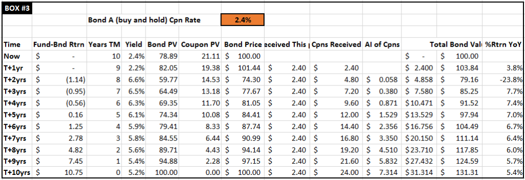
Based on the yields entered in Box #1, this is the projected bond math18 for the single 10yr Treasury over the next 10 years. The time axis runs vertically from top to bottom and is the same for Boxes #4 and #5. Note: the orange cells (coupon)19 can also be modified, but these default to equaling the 10yr yield for when the particular bond was issued.
Box #4
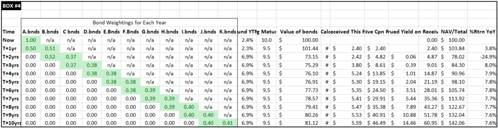
Based on the yields entered in Box #1, this is the projected bond math for the 10yr Treasury fund – in this case assumed to be a hypothetical ETF.1 The time axis is the same as in Boxes #3 and #5. The green cells show the # of bonds that the fund would hold at that moment in time. Each period represents the time immediately after a fund rolled into its annually-updated bond rebalance. These numbers represent fractional bond positions and not % weightings – the actual weighting between the two bonds is 50/50 after each roll (by assets invested).20
Box #5
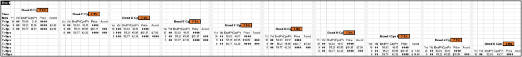
Based on the yields entered in Box #1, this is the projected bond math for each relevant 10yr Treasury that will be (at some point) held by the fund. Bond B refers to the bond issued one year after our single Treasury bond (which is also labeled as Bond A), Bond C is the bond issued one year after Bond B, etc.
The vertical time axis is the same as in Boxes #4 and #5. Only the relevant time slices are shown for each bond21. The orange coupon boxes follow the same convention as in Box #3.
Other notes and observations
- For the fund, even when yields are unchanged for multiple years (as happens in our default scenario), the value of the bonds from Graph B could still be increasing–this would be due to roll down within the 8 to 10yr yield curve since the slope is set to a non-zero value.
- If the yield curve were to stay unchanged for the next 10 years, the fund would cumulatively outperform the single 10yr Treasury by over 13%–this fund outperformance would be solely due to the upward slope of the yield curve. If there were slope then the fund and single Treasury returns would be equivalent.
- Starting again at a 10yr yield 2.4% initially, let’s instead say that in two years the 10yr yields rise to 25% and stay there. The Treasury ETF would still have a higher total return than a 10yr Treasury held to maturity. Yields would have to jump to 26% before the single Treasury would outperform the fund. This is again due to the upward slope of the yield curve.
- Regarding the applicability of this spreadsheet to other types of bonds (mainly municipal and corporate), Treasuries are probably the simplest type of bond to consider. Since these are assumed to be risk free, among other considerations, there’s no credit spread, variable credit ratings, defaults, special provisions, recovery values, callability, or credit spread dependencies on remaining maturity. Additionally, the liquidity of many municipal and corporate bonds is much lower than Treasuries, so the mark-to-market assumptions made in the spreadsheet would be less practical.
- If the spreadsheet’s single bond hold-until-maturity strategy were replaced by a bond laddering strategy, the returns for holding bonds directly would then be much more similar to the bond fund returns.
- Let me know if you see any mistakes; I’ll be happy to discuss and update this page and spreadsheet.
Disclaimer
This is not investment advice – please see the disclaimer.
Footnotes
- This is a hypothetical, simplified ETF where fractional bond positions are allowed and all assets are considered to be invested at all times (at various yields, as discussed later). Discounts/premiums to NAV are assumed to be 0, which in the case of Treasury ETFs is generally a reasonable assumption, +/- a few basis points. The index this hypothetical ETF would be tracking would be Treasuries with remaining maturities of 8.5 to 10 years. This compares with the IEF ETF, which targets a Treasury index with remaining maturities of 7 to 10 years. In terms of mutual bond funds vs ETF bond funds, the total returns would end up being functionally similar in this case, regardless of the type of fund.
- 10yr yield: 2.4%, 10yr – 1yr: 1.6%
- For the 2 to 9 year section of the projected yield curve, these yields are interpolated based on the entries for the 10yr and 1yr yields. The 1yr yields are by default set to equal the 10yr yields minus 1.6%.
- For simplicity, all examples discussed here assume that taxes, fees, commissions, and bid/ask spreads are all 0.
- At each point in time, the Treasury investment has a resale value. Although some holders of Treasuries are not interested in, for example, what the value of their 10-year bond is with 5 years until maturity (since they plan on holding it until maturity), their bond still has a relatively efficient value on the open/secondary market.
- Since the time snapshots are taken at the same interval as the coupon payments, the clean price will equal the dirty price, note 2: when a Treasury’s coupon is less than the market-determined yield (for its maturity), the bond will trade at less than par value ($100). This is sometimes referred to trading at a discount.
- This spreadsheet assumes only one coupon payment per year.
- The coupons are assumed to be reinvested at the prevailing yield for the remaining maturity of this single bond.
- The coupons are assumed to be reinvested at the weighted average of its portfolio’s prevailing yield for the remaining maturity of the bonds.
- The target maturity isn’t realized until T+1yr because (for simplicity) that is the first time a 2nd bond is available to be placed in the fund. Also, although the fund’s remaining maturity is shown stabilizing at 9.5 years on the graph, in reality that number is fluctuating between 8.5 years and 9.5 years. For simplicity, these graphs are only showing one point of time for each year, and that point of time happens to be right when the fund rolls out of the older bond and into the newly issued bond (with 10 years of maturity remaining).
- For more standard explanations of this topic, please see here or here.
- Following the convention of the other hypothetical Treasuries discussed so far, Bond Y and Bond Z both also pay out coupons annually so when taking annual time slices, the clean price = dirty price.
- This must hold to avoid arbitrage scenarios where a trading firm could make a risk-free profit by exploiting the inefficiency in the yield curve.
- To keep things simple I’m ignoring the coupon reinvestment income for now.
- The actual number is $98.06.
- In general, the further a Treasury is from maturing, the higher its yield. Here is one explanation of why the yield curve is usually sloped like this–one theory is that it’s largely because Treasury investors think the risk (both inflationary and default) of holding US government’s interest rate risk is a smaller problem short-term than long-term.
- If yields have been unchanged for at least a year AND the slope is 0 (so no roll down), this value should equal the prevailing yield for the appropriate remaining maturity.
- The yields for all bonds are interpolated from the entries in Box #1.
- For simplicity, coupons are assumed to be paid annually.
- The 50/50 weighting calculation does not consider the accumulated coupon income (which would have been eventually paid out by the fund in dividends) but is kept here to maintain an apples to apples comparison.
- For cleanliness, the numbers for bonds are not shown if they the bond has no current relationship with the fund.